Everything you need to use the Automat brand consistently. The mark, the wordmark, the palette, the typography, the patent-plate aesthetic, and the things we never do. If you're putting Automat on a slide, a deck, a press release, or a website, this is the source of truth.
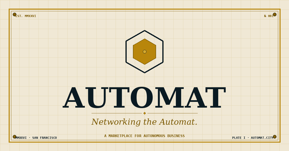
The Automat mark is a single nested hexagon with a brass-filled inner cell and a small bright dot at the centre. The hexagon is the deployment unit of an Automat block. The brass fill is the unit at work. The dot is the singularity that grows the network.
The mark works on three backgrounds. Use the variant that matches the surface you're putting it on.
Reserve a margin around the mark equal to the width of the inner brass hex. Nothing else in the layout enters that zone. The mark needs the breathing room because most of its weight lives at the centre, not the edges.
Minimum size: 24px on screens, 8mm in print. Below that, the inner hex stops reading and the mark looks like a smudge.
When you need both the mark and the name, lock them up horizontally. The mark sits on the left, the wordmark sits on the right, baseline-aligned to the centre of the mark. The wordmark is set in Fraunces Black at the same height as the mark itself.
In small contexts (mobile headers, slack icons, narrow page widths), the mark stands alone without the wordmark. In any context wide enough for both, use the lockup.
The Automat palette is intentionally small. Aged paper for backgrounds, deep ink for type and structure, brass for accent and emphasis. Nothing else. The discipline is the point.
There are no gradients in the system. Every brass surface is flat. The "metallic" feeling comes from the contrast between brass-light highlights and brass-dark shadows, applied as discrete stops, not as a gradient between them.
Three typefaces. Fraunces does headlines and italic emphasis. IBM Plex Sans does body prose. IBM Plex Mono does labels, eyebrows, and figure callouts. There is no fourth.
IBM Plex Sans carries the body prose. It's a humanist sans with enough character to sit next to Fraunces without disappearing, and enough discipline to read at small sizes for long stretches. Use it for everything that isn't a headline, an eyebrow tag, or a figure label.
Sentences run long when they're carrying an argument and stay short when they need to land a verdict. Both register correctly in Plex Sans because the type is sized to a comfortable 16px with 1.62 line height.
Italic Fraunces is reserved for one purpose: emphasising a single key word inside a Fraunces headline, set in brass-dark. Never italicise a full sentence. Never italicise body prose. The italic carries weight precisely because we use it sparingly.
Every Automat surface is rendered as if it were Plate I of a patent application from 1925. Brass border, corner rivets, blueprint grid, monospace title block, Roman numerals, figure captions. The look is the company's first promise: the work behind it is precise, documented, and built to last.
1. Brass border. 4px outer brass frame on every primary plate. Inner thin brass-dark line 10-12px inset.
2. Corner rivets. One in each corner. Brass-dark fill, ink outline, brass-light highlight at top-left of each rivet. Always four. Never three, never six.
3. Blueprint grid. 40px square grid in brass-soft (5-7% opacity), runs the full width and height of the plate. The grid is decorative documentation; nothing on the plate aligns to it.
4. Title block. Bottom-right corner of complex plates. Contains FIG. number in Fraunces, plate number in mono, descriptor and date in mono. Surrounded by brass border.
5. Legend. Top-right corner of complex plates. Brass border, mono LEGEND header, brass rule below, mono A-F entries pointing at the labelled parts of the drawing.
6. Figure callouts. Letters A-F pointing at the labelled parts of the drawing, with leader lines in brass-dark.
7. Roman numerals. Section numbers and dates use Roman numerals (MMXXVI, FIG. III, SECTION V) wherever there is space. Arabic numerals are reserved for prices, dates, and quantities where Roman numerals would be unreadable.
The Automat voice is the same voice you'd use in a long Slack message to a colleague who already understands the problem and just needs the new information. No throat-clearing, no positioning, no manifesto preamble. The first sentence is the observation.
Sentences run long when they carry an argument and stay short when they land a verdict. Numbers and named entities beat adjectives. The reader is technical and skeptical and has been burned before. We don't talk down to them.
Voice rules in detail are documented separately in the Writing Guidelines, which override this section if there's any conflict. Read those before writing anything that ships under the Automat name.
Every brand has a list of things it doesn't do. The Automat list is short and absolute.
Use brass as an accent. Frames, rules, italic emphasis, the centre dot of the mark. One accent per surface, used with discipline.
Brass is an accent colour, not a fill. Don't use brass for hero backgrounds, page fills, or large surfaces. It loses its weight and the plate stops feeling industrial.
One italic word per headline, in brass-dark, in Fraunces with SOFT 50 WONK 1. The italic is a verdict, not a decoration.
Italic Plex Sans for body text. Italic for whole sentences. Italic for "look at me." If the body needs emphasis, restructure the sentence so the emphasis lives in the words themselves.
SECTION I, FIG. III, MMXXVI. Roman numerals carry the patent-plate gravitas the system needs.
Prices, payback periods, capital amounts, and quantities stay Arabic. $4K not $IV K. Six months not VI months. Function before form.
The mark is a pointy-top hex. Diagrams of the deployment map use flat-top hexagons because flat-top tiles together better in a city block. Both orientations are correct in their own context.
The mark is hexagonal because the deployment unit is hexagonal. Substituting any other shape breaks the conceptual lineage from mark to map to product.
#F0E8D5 is the canonical surface. Surfaces shift to surface (#F8F1DE) for cards and to deep paper (#EDE3CB) for sectional shifts.
#FFFFFF and #000000 do not exist in the Automat palette. Pure white reads as a generic SaaS landing page. Pure black reads as a luxury watch ad. Neither is what we are.
Every asset on this page is available as a file. Right-click and save, or open in a new tab.
All assets are released for use by the Automat team and authorised partners. If you need a format that isn't listed here (vector EPS for print, dark-background OG image, larger raster sizes), email Tomasz.